
Let me be straight with you: I’ve analyzed hundreds of websites across dozens of industries, and moving company websites are some of the toughest to get right.
Why? Because they need to balance emotional appeal (you’re dealing with people’s homes, after all) with practical functionality (quote forms, service details, location specifics).
After spending countless hours reviewing moving company websites (yes, that’s how I spend some of my weekends—I’m that kind of marketing nerd), I’ve identified the cream of the crop.
These aren’t just pretty sites—they’re conversion machines that turn visitors into customers.
Let’s break down what makes these websites exceptional and what you can learn from them for your own business (even if you’re not in the moving industry).
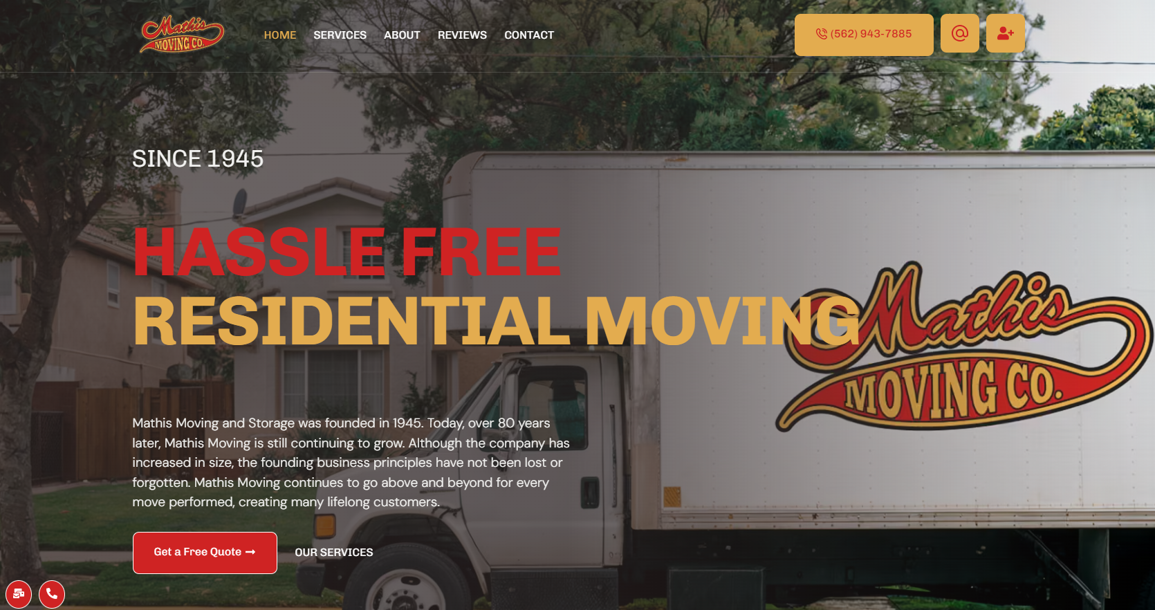
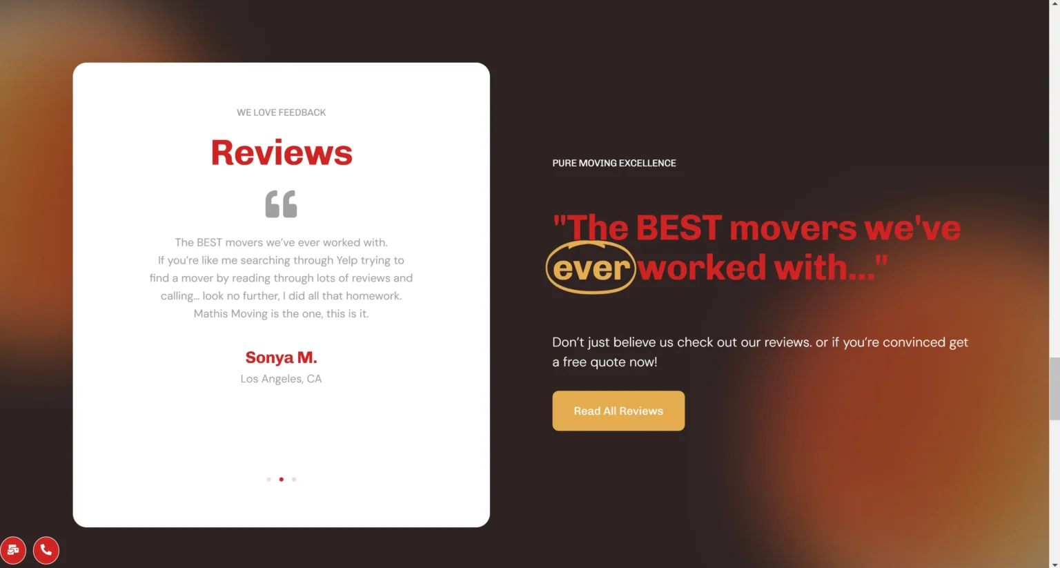
I was genuinely impressed when I first landed on MathisMoving.com. This Orange County/LA/San Bernardino moving company proves you don’t need to be a national chain to have a world-class website.
Why it stands out:
What really caught my attention was how they’ve structured their service pages. Each one clearly communicates value without overwhelming the visitor.
Their contact page is a masterclass in conversion optimization—clean, focused, and with just the right amount of information to make potential customers feel comfortable reaching out.
The big takeaway: Don’t assume that being a smaller, local business means you can’t compete on web design. MathisMoving.com demonstrates that thoughtful, user-focused design can help local businesses stand out against bigger competitors.
Website design by: suxcss.com
Website: Mathis Moving

When it comes to established moving companies, Einstein Bros has created a website that balances brand recognition with functionality.
What works well:
Their website does load a bit slower than Mathis Moving (I clocked about a 1.5-second difference on my tests), and their service pages could benefit from better organization.
I’ve noticed they frequently experiment with their header messaging—a smart strategy for continually improving performance. This kind of iterative approach to website optimization is something I always recommend to my clients.
The big takeaway: Regular updates and testing are critical for website success. Einstein Bros shows that even established companies should continuously refine their online presence.
Design by kickpoint

The first thing you’ll notice on Two Men and a Truck’s website is their impressive move counter prominently displayed in the header—an immediate trust signal.
Standout features:
One potential drawback: their movers appear quite young in their imagery, which might give some older customers pause. However, this is likely intentional positioning for their target demographic.
What impresses me most is how they’ve managed to maintain consistent branding and user experience across hundreds of franchise locations—not an easy feat!
The big takeaway: Transparency builds trust. Showcasing real numbers (like completed moves) gives potential customers confidence in your service.
Website design by: N/A
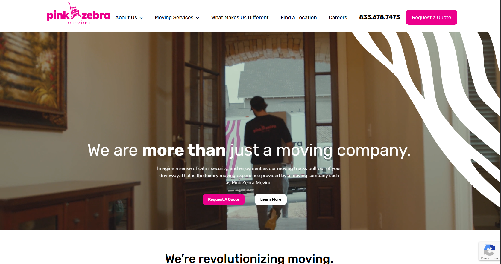
In an industry dominated by blue, green, and red color schemes, Pink Zebra Moving immediately catches your attention with their distinctive branding.
Why it works:
Their commitment to brand consistency across all touchpoints is something every business should emulate. The pink color scheme isn’t just a gimmick—it’s carried through the entire user experience in a thoughtful way.
The big takeaway: Don’t be afraid to break industry norms with your branding. A distinctive identity (when executed consistently) can be your greatest competitive advantage.
Website design by: N/A

Rounding out our list is College Hunks Hauling Junk and Moving—a company that’s managed to scale nationwide while maintaining a distinctive personality.
What they do right:
Their website does face some organizational challenges due to the sheer size of their operation. With so many services and locations, information architecture becomes increasingly complex.
However, they’ve done an admirable job maintaining usability despite these challenges. Their clear call-to-action buttons guide visitors effectively regardless of which page they land on.
The big takeaway: As your business scales, your website architecture needs special attention. College Hunks shows how to maintain brand personality even with a complex, multi-location service offering.
Website design by: N/A
After analyzing these five standout moving company websites, several key patterns emerge that you can apply to your own business:
Remember, your website isn’t just a digital brochure—it’s your hardest-working salesperson. It needs to capture attention, build trust, answer questions, and convert visitors—all while looking good and loading quickly.
What website elements have you found most effective for your business? Have you implemented any of the strategies used by these top-performing sites? Let me know in the comments below!